Traffic Sankey Flow Visualization
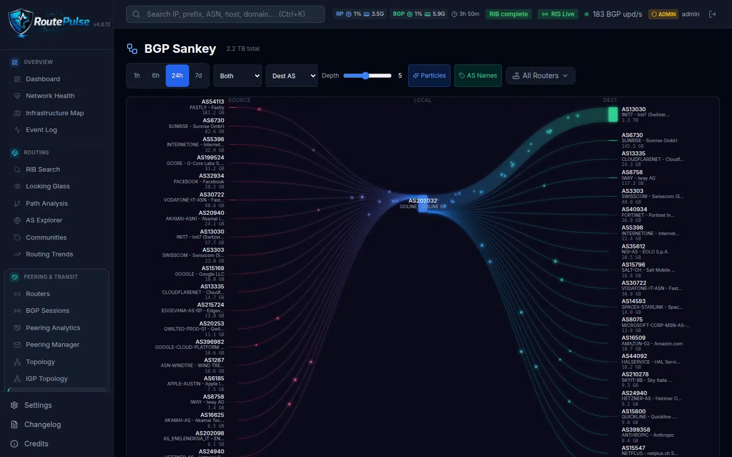
Understanding where your traffic originates and where it terminates is fundamental to capacity planning, peering optimization, and anomaly investigation. RoutePulse’s interactive Sankey flow visualization renders your entire traffic topology as a multi-column diagram — from upstream providers and IXP peers through your local ASN to destination ASNs, prefixes, applications, and countries — with animated particle flows that make traffic volume instantly intuitive. Unlike static charts that flatten complex routing relationships, the Sankey view reveals asymmetric flows, concentration risks, and unexpected traffic paths at a glance, enabling NOC engineers to make faster and more informed routing decisions.
Built with d3-sankey layout, React SVG, and an HTML5 Canvas overlay, the visualization delivers 60fps particle animation with up to 3,000 active particles whose spawn rates are proportional to traffic volume per link. Gradient color interpolation flows from source to destination nodes, creating an immediately readable traffic map. Initial render completes in under 500ms with layout recomputation in under 50ms, powered by sub-second API responses from ClickHouse — all in a bundle under 40KB gzipped. The control bar offers configurable time periods (1h, 6h, 24h, 7d), direction toggles for inbound, outbound, or both, and a depth slider from 1 to 10 controlling granularity (depth 1 shows top 3 sources/destinations, depth 10 shows top 30). Hover effects highlight the selected path at 0.7 opacity while dimming others and boosting particle speed for 300ms, and clicking opens a detail side-panel with traffic stats, protocol breakdowns, top applications, and destination ports. Low-traffic paths below 0.5% are auto-collapsed into an “Other” node for clean visualization, and responsive breakpoints across xl, lg, md, and sm ensure usability on both desktop and mobile.
Key Capabilities
- Interactive multi-column Sankey diagram: Source (upstream providers, IXP peers) to Local ASN to Destination (ASNs, prefixes, applications, countries)
- 60fps particle animation system with up to 3,000 active particles and spawn rates proportional to traffic volume per link
- Gradient color interpolation from source to destination nodes for intuitive traffic flow readability
- Initial render under 500ms, layout recomputation under 50ms, API responses under 1 second from ClickHouse
- Control bar with configurable time periods (1h, 6h, 24h, 7d), direction toggle (inbound/outbound/both), and depth slider (1-10)
- Hover effects: path highlight at 0.7 opacity, dim others, particle boost at 2x speed for 300ms
- Click-to-open detail side-panel with traffic stats, protocol breakdown, top applications, and destination ports
- Depth parameter controls granularity — depth 1 shows top 3, depth 10 shows top 30 sources and destinations
- Low-traffic paths below 0.5% auto-collapsed into “Other” node for clean visualization
- Responsive design across desktop and mobile (xl, lg, md, sm breakpoints)
- Native dark theme with SVG glow effects and gradient links, bundle size under 40KB gzipped
- Built with d3-sankey layout, React SVG, and HTML5 Canvas overlay for optimal rendering performance
Engineered and operated by the GOLINE SOC & Network Engineering team.
Explore all RoutePulse features →